
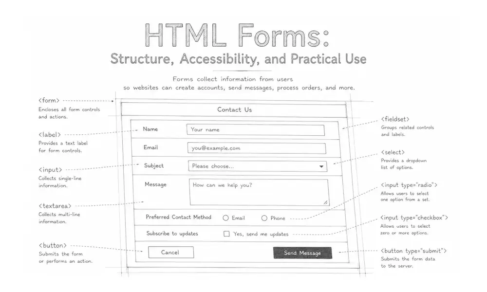
Form design best practices are principles for creating web forms that are clear, accessible, efficient, and easy to complete. A well-designed form helps people understand what information is needed, correct mistakes without losing their work, and complete a task with reasonable effort.
Forms are among the most important interaction points on a website. They support contact requests, account registration, purchases, applications, surveys, searches, and many other tasks. Their quality depends on more than visual appearance. Structure, language, validation, accessibility, privacy, and technical behavior all shape the experience.
Begin with the form’s purpose
Before choosing fields or arranging a layout, define what the form allows someone to accomplish. A form should have a recognizable purpose that can be explained in a short sentence, such as:
- Send a question to the support team.
- Create an account.
- Request an estimate.
- Reserve an appointment.
- Complete a purchase.
The purpose helps determine which information is genuinely necessary. It also provides a basis for reviewing the form later. If a field does not support the immediate task, a legal requirement, or a clearly explained user benefit, it may not belong in the form.
Purpose also shapes the expected level of effort. A short contact request should usually remain short. A mortgage application, medical intake form, or detailed service request may reasonably require more information, but the structure should reflect the complexity of the task.
Keep forms focused
Every field introduces another decision, another opportunity for error, and another piece of information the user must decide whether to share. Focused forms reduce unnecessary cognitive and physical effort.
When reviewing a form:
- Ask only for information needed at the current stage.
- Remove duplicate or substantially similar questions.
- Avoid collecting information merely because it may be useful later.
- Explain why sensitive or unexpected information is required.
- Allow optional details to remain optional.
- Divide genuinely complex tasks into understandable steps.
Shorter is not always better. A form should be complete enough to support its purpose. The goal is not the smallest possible number of fields, but the least unnecessary effort.
Clearly distinguish required and optional fields
Users should not have to submit the form to discover which fields are required. State the convention near the beginning and identify fields consistently.
For example, a form may mark required fields with the word “required” or mark optional fields with “optional.” If an asterisk is used, explain its meaning. The required state should also be represented programmatically with the HTML required attribute when appropriate.
Use clear, persistent labels and instructions
Each form control needs a visible label that tells the user what information to provide. Labels should remain available while the field contains text. Placeholder text disappears during entry and should not be used as the only label.
A useful label is concise and specific:
- “Email address” is clearer than “Contact.”
- “Billing ZIP code” is clearer than “ZIP.”
- “Date of birth” is clearer than “Date.”
Labels should be programmatically associated with their controls. In HTML, this is commonly done by matching the label’s for attribute to the input’s id.
<label for="email">Email address</label>
<input
  type="email"
  id="email"
  name="email"
  autocomplete="email"
  required
>
This association makes the form easier to understand with assistive technology. It also enlarges the practical interaction area because selecting the label can move focus to the associated control.
Place instructions where they are needed
General instructions belong near the beginning of the form. Field-specific instructions should appear close to the relevant field and, when necessary, be connected programmatically with aria-describedby.
<label for="password">Password</label>
<p id="password-help">
  Use at least 12 characters.
</p>
<input
  type="password"
  id="password"
  name="password"
  autocomplete="new-password"
  aria-describedby="password-help"
  required
>
Instructions should explain real requirements. Avoid presenting complex password rules, date formats, or document requirements only after the user makes an error.
Choose the appropriate form control
The control should match the type of answer being requested. Familiar controls reduce the amount of interpretation required.
- Use a text input for a short, open-ended answer.
- Use a text area for longer written responses.
- Use radio buttons when one option must be selected from a small visible set.
- Use checkboxes when multiple options may be selected.
- Use a select menu when its compact form is helpful and the available options are familiar.
- Use native date, time, email, telephone, and number controls when their behavior fits the task.
Native HTML controls generally provide established keyboard behavior, browser support, and accessibility semantics. Custom controls may be appropriate in some interfaces, but they require careful implementation and testing. The guidance in ARIA and accessible applications is especially relevant when native elements cannot represent the required interaction.
Do not use a numeric input merely because an answer contains digits
Telephone numbers, postal codes, account identifiers, and credit card numbers are not quantities. Users do not perform arithmetic with them, and leading zeros may matter. A text or telephone input with suitable autocomplete and input-mode support is often more appropriate than type="number".
<label for="postal-code">Postal code</label>
<input
  type="text"
  id="postal-code"
  name="postal-code"
  autocomplete="postal-code"
  inputmode="numeric"
>
The correct implementation may vary by country and audience. International forms should avoid assuming that every postal code, telephone number, personal name, or address follows one local format.
Reduce user effort
Efficient forms reduce repetitive typing and avoid making users translate their information into an unnecessarily rigid structure.
Helpful techniques include:
- Using recognized
autocompletetokens for names, addresses, email addresses, telephone numbers, and payment details. - Providing sensible defaults when the likely choice is known and changing it is easy.
- Reusing previously entered information with permission.
- Allowing a billing address to match a shipping address.
- Displaying the appropriate keyboard through suitable input types and
inputmode</code values. - Accepting common variations in spaces, punctuation, capitalization, and formatting.
Avoid disabling paste. People may use password managers, assistive tools, or carefully copied information to complete a form. Blocking paste often creates more difficulty without ensuring that the information is correct.
Use input masks cautiously
Input masks can clarify an expected format, but they can also interfere with typing, pasting, editing, autofill, and assistive technology. If formatting is necessary, allow reasonable variations and normalize the data after entry when possible.
For example, a telephone field can often accept spaces, parentheses, hyphens, and international prefixes rather than forcing one exact pattern during entry.
Preserve the user’s work
A temporary connection problem, validation error, or accidental navigation should not erase an entire form when preservation is technically and ethically appropriate. This is especially important for long applications and multi-step processes.
Care is needed when retaining sensitive information. Passwords, payment details, medical information, and other private data require stricter handling than ordinary contact fields.
Design validation to help users recover from errors
Validation should help users provide usable information, not test whether they can infer hidden rules. Effective validation identifies the problem, explains how to correct it, and preserves the rest of the form.
A useful error message should:
- Identify the affected field.
- Describe the specific problem.
- Explain the expected correction.
- Avoid blaming or scolding the user.
- Remain available until the issue is resolved.
“Enter an email address in the format [email protected]” is more useful than “Invalid input.”
Choose an appropriate validation time
Validation timing should reflect the task. Displaying an error while someone is still typing can be distracting. In many cases, validation works better after a person leaves the field or submits the form.
Some feedback can reasonably appear earlier. A password-strength explanation or a character count may help while the user is composing an answer. The distinction is whether the feedback supports the task or repeatedly interrupts it.
Make errors perceivable
Do not communicate an error with color alone. Combine visual styling with text, icons where useful, and programmatic information that assistive technologies can interpret.
For longer forms, an error summary near the beginning can list the problems and link to the affected fields. Move focus thoughtfully so keyboard and screen-reader users are made aware of the summary without losing their place unexpectedly.
Browser-based validation can support the experience, but important rules must also be enforced on the server. Client-side validation can be bypassed and should not be treated as a security boundary.
Build accessible forms from the beginning
Accessible form design supports people using keyboards, screen readers, voice input, magnification, alternative pointing devices, and other assistive technologies. It also helps users working with small screens, temporary injuries, limited attention, or unfamiliar terminology.
Important accessibility practices include:
- Associate every control with an accurate label.
- Use native HTML elements whenever they fit the interaction.
- Maintain a logical heading, reading, and focus order.
- Ensure that all controls can be reached and operated with a keyboard.
- Provide visible focus indicators.
- Maintain sufficient text and interface contrast.
- Make instructions and error messages programmatically available.
- Avoid relying on color, position, sound, or shape alone.
- Allow text to resize and layouts to reflow without losing functionality.
- Provide adequately sized and spaced interaction targets.
Understanding WCAG provides a broader foundation for accessible website design. Forms should also be reviewed using practical keyboard navigation best practices, not only automated testing tools.
Use ARIA to supplement sound HTML
ARIA can communicate states, descriptions, and relationships that native markup does not fully express. It should generally supplement semantic HTML rather than replace it.
For example, aria-describedby can associate instructions or an error message with a field. aria-invalid="true" can indicate that a submitted value has failed validation. Dynamic announcements may use an appropriate live region, but excessive announcements can make a form harder to use.
Design forms for mobile devices
Mobile form design is not simply a desktop form compressed into a narrow column. People may be using one hand, working in bright light, moving between applications, or completing the task over an inconsistent connection.
Mobile-friendly forms should provide:
- A single-column layout in most situations.
- Readable text without requiring zoom.
- Enough space between interactive controls.
- Touch targets that can be selected accurately.
- Input types and modes that display useful keyboards.
- Layouts that do not require horizontal scrolling.
- Submit controls that remain easy to find without covering content.
A two-column arrangement can appear efficient on a wide screen but become difficult to follow when it wraps unpredictably. Test the form at multiple viewport sizes and with browser zoom rather than relying on a single device preview.
Use multi-step forms when the task genuinely benefits
Breaking a form into steps can make a complex process easier to understand, but unnecessary steps can also hide the amount of work involved. Use a multi-step structure when the questions form meaningful stages or when later questions depend on earlier answers.
A multi-step form should:
- Identify the current step.
- Provide a meaningful progress indicator.
- Use descriptive step names when possible.
- Allow users to review and revise earlier answers.
- Preserve information while moving between steps.
- Explain what remains before final submission.
A progress indicator should not imply false precision. “Contact details, project information, review” may be more understandable than an unexplained percentage.
Support privacy and user confidence
Users should understand what information is being collected and what will happen after submission. This is particularly important when a form requests personal, financial, medical, employment, or account information.
Provide relevant context near the point of collection:
- Explain why unexpected information is needed.
- Link to a readable privacy policy when personal data is collected.
- Avoid preselecting optional marketing consent.
- Separate consent choices when they serve different purposes.
- Identify whether information will be shared with another organization.
- Use secure transmission and appropriate server-side protections.
The submit button should describe the action when practical. “Create account,” “Send message,” and “Place order” are more informative than “Submit.” For consequential actions, provide a review step or clearly state what selecting the button will do.
Confirm successful submission
After submission, provide an unmistakable confirmation. The confirmation should explain whether the form was received, what happens next, and whether the user needs to take another action.
Prevent accidental duplicate submissions where possible. While a request is processing, communicate that state without leaving the user uncertain. If processing fails, preserve the entered information and provide a useful path to recovery.
Test the complete form experience
A form can look correct while still failing during keyboard use, autofill, validation, or submission. Testing should cover the complete interaction rather than only the initial layout.
Review forms with:
- Keyboard-only navigation.
- Screen readers on representative browser and device combinations.
- Browser zoom and increased text size.
- Mobile and desktop viewports.
- Autofill and password managers.
- Copied and pasted values.
- Slow or interrupted connections.
- Valid, invalid, incomplete, and unusually formatted data.
- Long names, international addresses, and translated text.
- Successful submissions, server errors, and repeated submissions.
Automated accessibility and code-quality tools can identify certain missing labels, contrast issues, and invalid attributes. They cannot determine whether instructions are understandable, the field sequence is logical, or the recovery experience is humane. Human review remains necessary.
Common form design mistakes
- Using placeholder text instead of persistent labels.
- Requesting information that is not needed for the task.
- Hiding formatting rules until after submission.
- Displaying generic messages such as “An error occurred.”
- Clearing valid information when one field contains an error.
- Communicating required fields or errors through color alone.
- Using custom controls without complete keyboard support.
- Disabling paste or interfering with password managers.
- Assuming all names, addresses, and telephone numbers use one format.
- Presenting a visual order that differs from the document and focus order.
- Using a vague submit button label.
- Failing to provide confirmation after submission.
- Testing only with a mouse on a desktop computer.
Form design checklist
Before publishing or revising a form, confirm that:
- The form has one clearly defined purpose.
- Every requested field is necessary or clearly optional.
- Every control has a visible, programmatically associated label.
- Related fields are grouped semantically and visually.
- Instructions appear before users need them.
- Input types, autocomplete values, and input modes fit the requested data.
- The keyboard and reading order follow the visible layout.
- Focus indicators are clear.
- Errors identify the problem and explain how to correct it.
- Error communication does not rely on color alone.
- Previously entered information survives validation errors.
- The form remains usable on small screens and at increased zoom.
- Privacy information is available where relevant.
- The submit button describes the action.
- Successful and unsuccessful submissions both produce clear feedback.
- The complete experience has been reviewed by people, not only automated tools.