

A loading state is the condition an interface presents while it waits for data, completes an action, or prepares content for use. It tells people that the system received their request and that work is still taking place.
Effective loading states are not merely visual effects. They are part of the conversation between an interface and its users. They reduce uncertainty, preserve context, and provide enough feedback for someone to decide whether to wait, continue, or take another action.
What loading states do
When an interface does not respond immediately, users must interpret the silence. They may wonder whether a button worked, a form was submitted, the network disconnected, or the page stopped responding. A loading state replaces that uncertainty with useful information.
A well-designed loading state can communicate several things:
- The interface received the user’s action.
- The requested operation has started.
- The system is still working rather than frozen.
- Some content is available while other content remains in progress.
- The user should wait, continue elsewhere, or cancel the operation.
- The process has completed, failed, or produced no results.
This makes loading feedback a functional part of interface engineering. Its purpose is not to disguise every delay. Its purpose is to keep the interface understandable while time passes.
When loading feedback is needed
Not every operation needs a visible spinner, progress bar, or placeholder. Very short interactions may feel immediate, and briefly displaying an indicator can introduce more visual disruption than clarity.
Loading feedback becomes more important when:
- a user initiates an action with no immediate visible result;
- content is retrieved asynchronously;
- a form submission or payment process may take several seconds;
- a file is uploading, downloading, converting, or processing;
- navigation requires a noticeable wait;
- only part of a page is being updated;
- the same action could be submitted more than once;
- the duration is uncertain or depends on network conditions.
The first feedback does not need to be elaborate. A button label changing from “Save” to “Saving,” for example, may communicate more clearly than a large overlay or animated loader.
The appropriate response depends on duration, scope, risk, and context. A delayed search suggestion and a large file upload are both asynchronous operations, but they do not need the same loading treatment.
Common types of loading states
Textual status messages
Short messages such as “Loading results,” “Saving changes,” or “Preparing download” explain what is happening directly. Text is especially useful when the operation is specific or when an icon alone could be ambiguous.
Status language should reflect the actual operation. “Processing image” is more informative than a generic “Please wait.”
Loading spinners
A spinner indicates ongoing activity when the completion time is unknown. It is suitable for short, indeterminate waits, particularly within a button, panel, or other limited region.
A spinner does not communicate progress or estimated duration. If a process may take a long time, an endlessly rotating symbol can increase uncertainty rather than reduce it.
Determinate progress indicators
A determinate progress bar shows measurable advancement toward completion. It is appropriate for uploads, downloads, installations, data imports, and other operations where the system can calculate meaningful progress.
Progress values should represent real work whenever possible. A bar that moves artificially and then pauses near completion may create misleading expectations.
Indeterminate progress indicators
An indeterminate bar or activity indicator communicates that work is underway without claiming to know how much remains. This can be useful when the system can detect activity but cannot calculate completion accurately.
Skeleton screens
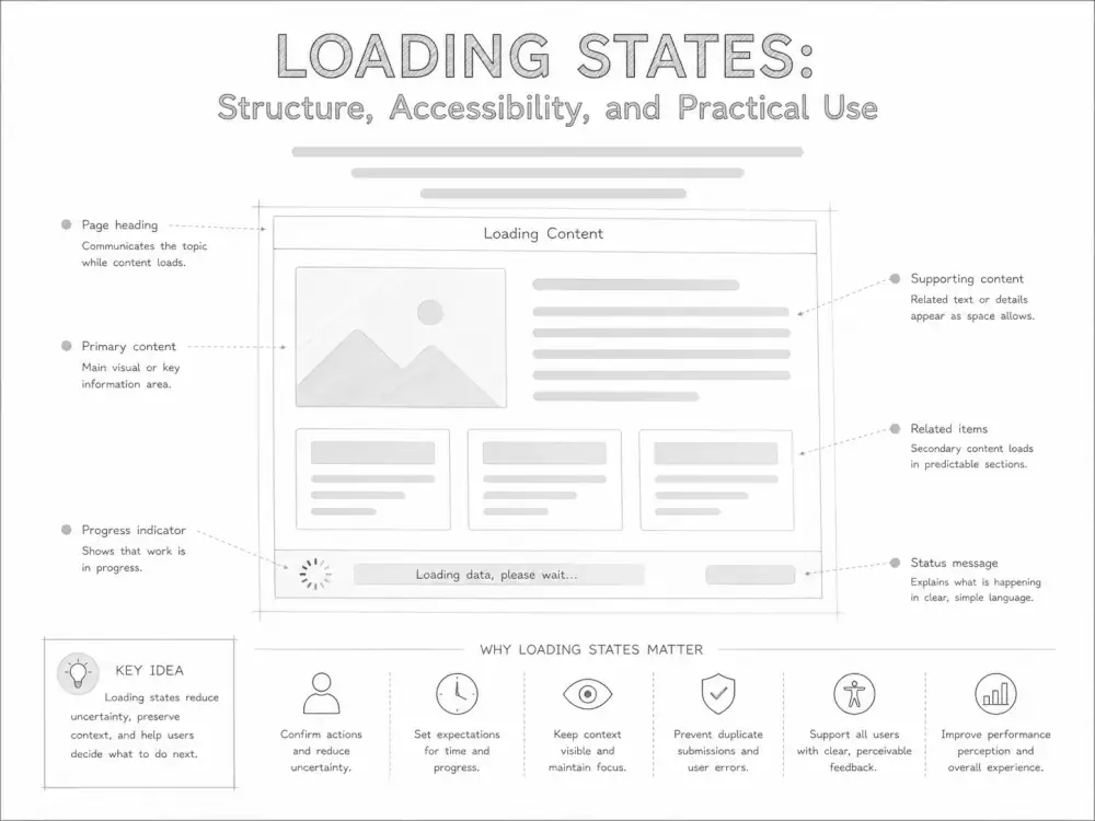
A skeleton screen displays a simplified representation of the layout that will eventually contain the requested content. It can preserve spatial structure and reduce abrupt layout changes while text, images, or records load.
Skeletons are most useful when they approximate a stable, predictable layout. They become less helpful when they misrepresent the final content, animate excessively, or create a large amount of placeholder noise.
Placeholder content
Placeholders reserve space for content that is not ready. They may include neutral image areas, empty text blocks, or temporary labels. Unlike a full skeleton screen, a placeholder may apply to only one element.
Placeholder content should be distinguishable from real content. Users should not have to determine whether a gray block is interactive, incomplete, or intentionally empty.
Progressive loading
Progressive loading presents usable content as it becomes available instead of holding the entire interface until every resource has finished. A page might render its heading and primary text before secondary images, recommendations, or related data arrive.
This approach can improve both usability and perceived responsiveness, provided that new content does not repeatedly displace what the user is already reading or interacting with.
Optimistic interfaces
An optimistic interface presents the expected result before the server confirms that an operation succeeded. A newly added item might appear in a list immediately while synchronization continues in the background.
This pattern can make frequent, low-risk actions feel responsive. It also requires a reliable recovery path. If the operation fails, the interface must explain what happened and restore or reconcile the affected state without silently losing user input.
Choosing the right loading pattern
The right pattern depends on what the system knows and what the user needs to understand.
| Situation | Possible pattern | Primary purpose |
|---|---|---|
| A short operation with unknown duration | Spinner with a brief status label | Confirm that work has started |
| A measurable upload or download | Progress bar with percentage or transferred amount | Show advancement and remaining work |
| A predictable content layout | Skeleton screen | Preserve spatial orientation |
| Independent page regions loading separately | Local placeholders or progressive loading | Keep available content usable |
| A frequent, reversible, low-risk action | Optimistic update with failure recovery | Provide immediate interaction feedback |
| A sensitive or irreversible action | Explicit processing state followed by confirmation | Prevent duplicate actions and preserve confidence |
The most visually complex option is not necessarily the most useful. A small local status message often provides better feedback than blocking the entire page.
Preserving interface continuity
Loading should not make an interface feel as though it has disappeared and been replaced by an unrelated screen. Whenever possible, preserve the user’s location, surrounding content, and understanding of what initiated the operation.
Interface continuity may include:
- keeping the page heading and navigation visible;
- showing a loader within the component that is changing;
- reserving dimensions for images and other delayed content;
- retaining entered form values while submission is in progress;
- keeping stable content interactive when it is safe to do so;
- returning focus to a logical location after completion;
- transitioning clearly from loading to success, empty, or error states.
Blocking the whole interface may be appropriate when proceeding would be unsafe or when the operation changes the entire application state. In many other cases, local loading feedback is more precise and less disruptive.
A loading state is also part of a larger sequence:
- The interface is ready for an action.
- The user initiates the action.
- The interface acknowledges it immediately.
- The operation continues in a loading or processing state.
- The interface resolves into success, content, an empty result, or an error.
Designing the full sequence helps prevent incomplete transitions, such as a spinner that remains visible after an error or a button that never becomes usable again.
Accessibility considerations for loading states
Visual movement alone does not communicate loading status to everyone. Dynamic interfaces should expose important state changes in ways that assistive technologies can interpret.
Provide meaningful text
When the loading state matters to task completion, provide a concise textual description. An unlabeled animation may be ignored by a screen reader or announced without enough context.
Use live announcements carefully
Status messages can be associated with an appropriate live region so screen readers announce meaningful changes. Routine updates generally should not interrupt the user. Frequent announcements, rapidly changing percentages, or repeated “loading” messages can become disruptive.
The HTML <output> element, role="status", and carefully chosen aria-live behavior may be useful depending on the interaction. The implementation should be tested with actual assistive technology rather than assumed to work from markup alone.
Communicate busy regions
The aria-busy="true" attribute can indicate that an element or region is being updated. When processing is complete, its value should be changed or the attribute removed. This state does not replace a useful visible message when users need one.
Use progress semantics accurately
A measurable operation may use a native <progress> element or an appropriately implemented progress-bar role. Values and labels should correspond to actual progress. An indeterminate process should not claim a percentage that the system cannot support.
Do not rely on animation alone
Status should remain understandable without motion. Loading indicators should also respect reduced-motion preferences where applicable. Rapid pulsing, shimmering, and repeated movement can be distracting or uncomfortable.
Manage focus deliberately
Starting a loading operation does not usually require moving keyboard focus. If new content replaces a substantial region or opens a new step in a task, focus may need to move after completion. The choice should follow the user’s task rather than the visual transition.
These practices are part of broader web accessibility and WCAG-aware interface design.
Loading states and performance
Loading design and performance engineering are related, but they are not interchangeable. A polished skeleton screen cannot compensate for an unnecessarily slow application. Likewise, a technically fast operation may still feel unreliable if the interface provides no acknowledgment.
Actual performance concerns measurable behavior such as response time, rendering time, resource delivery, and interaction latency. Perceived performance concerns how clearly and continuously the interface responds while those events occur.
Good loading behavior supports perceived performance by:
- acknowledging input without delay;
- showing useful content as soon as it is ready;
- preserving layout stability;
- prioritizing primary content over secondary resources;
- avoiding unnecessary full-page blocking;
- communicating unusually long operations honestly.
The underlying delay should still be investigated. Network requests, database queries, third-party scripts, oversized assets, and inefficient rendering can all contribute to waiting time. Loading states should make necessary waits understandable, not normalize avoidable ones.
For a broader foundation, see Understanding Website Performance.
Durable implementation principles
Loading-state behavior should be designed as part of the component or workflow rather than added after development as a decorative layer.
Acknowledge actions immediately
Buttons, controls, and forms should provide a prompt response when activated. This may be a change in label, appearance, state, or nearby status text.
Match the indicator to the scope of work
If one card is refreshing, show the state within that card. If the entire workspace is being replaced, broader feedback may be appropriate. The visual scope should help identify what is unavailable and what remains usable.
Prevent unsafe duplicate actions
A submission control may need to be temporarily disabled while a request is processed. However, disabling should not be the only feedback. Users still need to know why the control changed and whether the request is continuing.
Preserve user input
Loading and error transitions should not discard form entries, edits, or selections without a clear reason. Preserving input reduces repeated work and makes recovery more manageable.
Plan for every resolution
An asynchronous operation can succeed, fail, return no data, time out, be canceled, or complete only partially. Each meaningful outcome needs an understandable interface state.
Avoid fabricated precision
Do not show a specific percentage or completion estimate unless it has a reasonable connection to the work being performed. Honest uncertainty is more useful than a precise-looking indicator that does not represent actual progress.
Allow cancellation when it is meaningful
Long-running or optional operations may benefit from a cancel control. Cancellation must have defined behavior: it should stop the work when possible, preserve relevant state, and explain what was or was not completed.
Common loading-state mistakes
- Showing a loader for every small delay: indicators that flash briefly can create distraction and make a fast interface appear less stable.
- Using animation without information: movement confirms activity but may not explain what is happening or what the user should expect.
- Blocking more of the interface than necessary: a full-page overlay can prevent useful work while only one region is updating.
- Allowing layout shifts: content that repeatedly moves as resources arrive can interrupt reading and cause accidental interactions.
- Leaving controls in an ambiguous state: users should know whether an action is processing, completed, unavailable, or safe to repeat.
- Ignoring failure paths: every loading state needs a defined transition when the request fails or times out.
- Using skeletons that do not match the content: misleading placeholders can make the eventual interface feel unstable.
- Announcing too many updates: excessive live-region messages can make an accessible interface harder to use.
- Masking persistent performance problems: loaders should support necessary processing, not substitute for performance work.
Testing loading experiences
Loading states are easy to overlook on fast development connections. They should be tested under conditions that reveal the full interaction sequence.
Useful testing conditions include:
- slow or unstable network connections;
- large data sets and files;
- delayed server responses;
- failed and partially completed requests;
- repeated clicks or submissions;
- keyboard-only navigation;
- screen-reader use;
- reduced-motion settings;
- small screens and zoomed layouts;
- navigation away from an operation that is still running.
Testing should examine more than the loading graphic. Review whether the initial action is acknowledged, whether usable content remains available, whether status is announced appropriately, and whether every outcome resolves cleanly.
Frequently asked questions
What is a loading state in user interface design?
A loading state is the condition an interface displays while data, content, or an action is still being processed. It communicates that the system is active and helps users understand what is happening during a delay.
Should every asynchronous action show a spinner?
No. Very short operations may not need a visible indicator, and some actions are better served by a changed button label, local status message, placeholder, or progressive update. The feedback should match the duration and scope of the operation.
When should a progress bar be used instead of a spinner?
Use a progress bar when the system can measure advancement meaningfully. Use an indeterminate indicator when work is underway but the remaining duration cannot be calculated reliably.
Are skeleton screens always better than spinners?
No. Skeleton screens work well for predictable content layouts and progressive page rendering. Spinners or textual status messages may be clearer for small components, actions without a content layout, or short indeterminate operations.
Loading states are part of the interface conversation
A loading state should answer a practical question: what does the user need to know while the system is working?
Sometimes the answer is a short message. Sometimes it is measurable progress, a reserved content structure, or an immediate optimistic update with a careful recovery path. In every case, the goal is to preserve orientation and make the transition between action and result understandable.
Thoughtful loading states do not call attention to themselves unnecessarily. They acknowledge delay, communicate system status, and help the interface remain coherent until the next meaningful state is ready.